Internal reference
Style guide
Color
Warm cream
#FBF6EC · surface-primary
Light surfaces, inverse text, calm sections. Also the footer's sand.
Near-black navy
#040915 · brand-secondary
Default text, the 1.5px poster outline, hard shadows, dark surfaces.
Nice yellow
#FCDA49 · brand-accent
Punctuation, never wallpaper: the strongest CTA, Stan, one loud callout per page.
Nice blue
#224599 · brand-primary
The dominant field. Most sections stand on it; links and primary controls use it on cream.
Contrast pairs
Navy on cream
18.48:1
Blue on cream
8.19:1
Cream on blue
8.19:1
Yellow on blue
6.42:1
Navy on yellow
14.47:1
Cream on raised blue
7.06:1
Typography
Headlines are set in Nohemi, a bold, friendly display font. Everything else, paragraphs and small labels, uses the reader's own device font, so it always looks clean and loads instantly.
It's a nice day.
Nohemi, heaviest weight, all caps. As big as it gets, for the main headline on a page. Tight letter spacing.
Pest control that actually works.
Nohemi, bold, sentence case. Large. Normal letter spacing, for a headline that runs a full sentence long.
Why homeowners choose Nice
Nohemi, bold. Medium-large. For the headings inside a page.
No contracts, ever
Nohemi, bold. Medium. For a label on a card or a box.
Good to know
Nohemi, bold, all caps. Small, with wide letter spacing. The little label that sits above a heading.
Body text is set in the reader's own device font: calm, easy to read, and always left-aligned.
Paragraphs run at a comfortable reading size with roomy line spacing. Long copy is never centered and never set in Nohemi.
Device font (system sans-serif). A few sizes, normal letter spacing, for paragraphs and small print.
Buttons
Outline, radius, shadow
The radius scale
2px
Buttons. The poster button is square, not a pill.
6px
Small controls, form inputs, compact labels.
8px
Deck objects: service cards, image windows, the photo frame's mat.
12px
Cards, panels, accordion rows, photo tiles.
16px
Large feature panels: referral, estimate, the closing form card.
20px
Hero photography and major image windows.
pill
Chips, compact badges, the check disc.
The shadow ladder
-8px 8px 0
Buttons (the canonical -8px 8px 0)
-10px 10px 0
Service card hover, photo frames
-12px 12px 0
Closing form card, the 212px phone seal
-14px 14px 0
Photo tile hover pop
-18px 18px 0
The 312px spoke hero seal
-20px 20px 0
The estimate panel
Cards and panels
Quiet
A calm box that sits back a step. For side information the reader doesn't need to act on.
Working
A bright cream box that steps forward. This is where people do something, like fill out a form.
Loud
The one big yellow callout. Use it once on a page, never twice.
-
No contracts, ever.
-
Same friendly tech every visit.
The specimen card
A tappable card for one service. The two main plans are yellow, every other service is blue. Each one has a dark outline, a small number in the corner, the pest sticker, and the service name with an arrow. When you hover over it, it lifts up a little and tilts.
The blog card
A card for a blog post: a photo on top, the date, the title with an arrow, and a short preview. Hovering nudges it up a little.
Stickers
Badges and seals
referrals in two years
1,400+
Number badge
Top payout so far
$1500
Cut-corner badge
Service seal
Company seal
Google rating
Photography
Use real, candid photos: our own team, real Valley homes, trucks at work. Never stiff, posed stock photos.
How to frame a photo
Put it in a cream mat with a thin navy outline, round the corners a little, tilt it just a few degrees, and drop a hard shadow behind it.
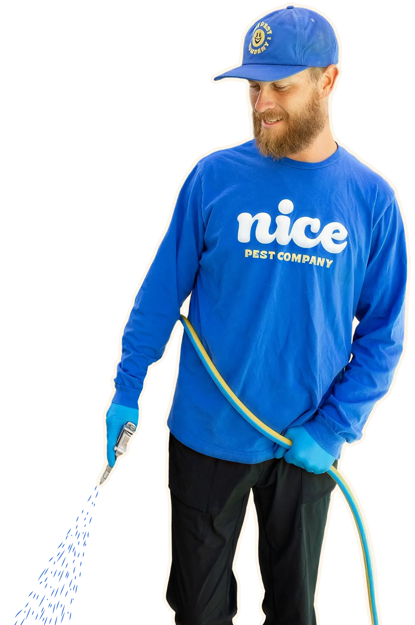
Cutout photos
Sometimes we cut the person out of their photo, give them a thin cream outline so they read like a sticker, and let them break out of their box: feet trimmed at the bottom edge, head and shoulders rising above the top. A hand-drawn touch like the spray adds life.
It's a big, playful moment, so save it for a spot that deserves one. You'll see it on the homepage's opening steps and on Refer a friend.
How it works
Three easy steps.
Illustration
Our pictures are flat and clean, like a printed sticker or an old road sign, never a painting. Bold outlines, filled with our four colors, and nothing fuzzy: no gradients, no grain, no soft shadows inside the art. If you ever make a new one, match the desert below: simple shapes, flat color, a friendly feel, and just a hint of tilt to keep it lively.